The City of Ryde
Rebranding
The City of Ryde is a local government area in the Northern Sydney region in New South Wales, Australia. The council currently has its creativity strategic plan in place. They offer different opportunities for creative people to thrive in Ryde such as the art exhibition area, and sustainability art contest, Artist-in-Residence program, etc.
The purpose of rebranding was to make the City of Ryde a contemporary brand and align it with its current strategic planning. The target audience was the creative people living in other suburbs.
The city of Ryde is connected to the City of Sydney through different modes of transport such as ferry, metro, train, bus, and car. It also offers people a beautiful suburban life with proximity to nature- the Parramatta River, lots of green space, different kinds of birds, big blue sky. Study shows that living close to nature enhances people’s creativity.
So my concept was “The best of both worlds” to highlight the fact that The City of Ryde offers both- a suburban life that will help enhance people’s creativity as well as the benefit of city life by its strong connectivity to the City of Sydney.
I visually represented my concept by pairing contrasting fonts, and colors. For images, I paired both colored and black-and-white images. The graphical elements was derived from the “ / ”- or sign that divide two different things. In tone of voice I paired the opposite words such as “in and out”
Student Project- Shillington Graduate 2023

Instagram tile
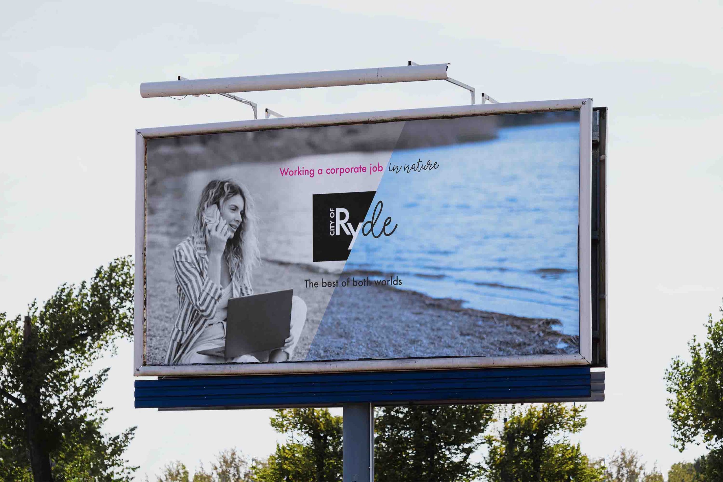
Billboard design
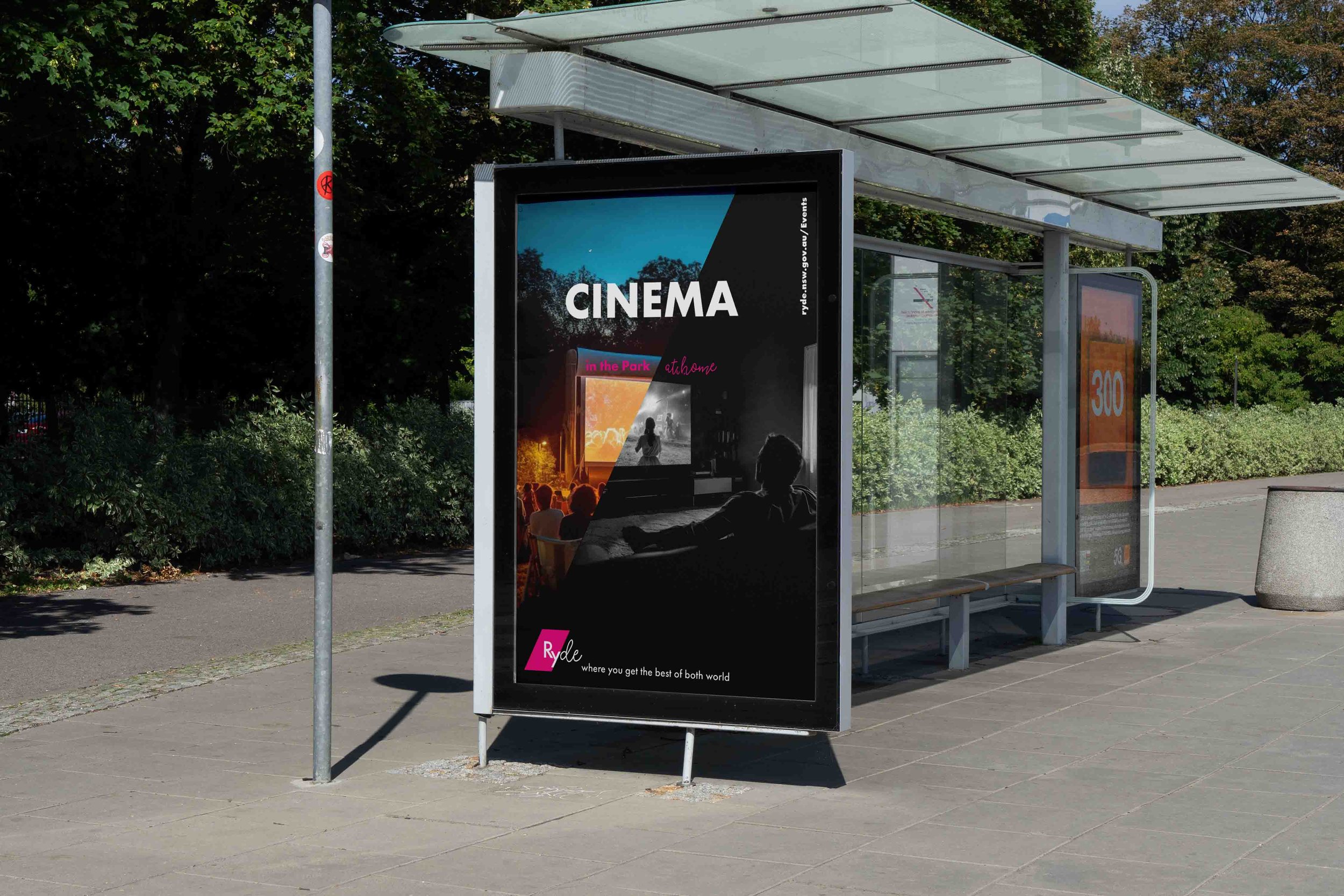
Advertisement at the bus stop

The City of Ryde's new council building entry

Poster series

Library bag

Volunteer t-shirt